Enhancing the User Interface
Master the Toolbox and essential UI controls in Visual Basic 2026 to build professional, polished Windows Forms applications — with AI-assisted layout suggestions from GitHub Copilot.
3.1 Mastering the Toolbox
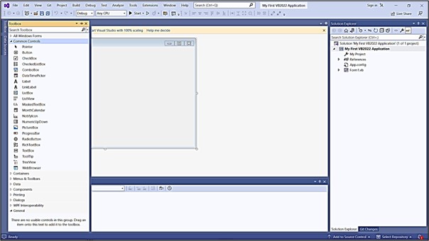
The Toolbox is your primary resource for adding controls to a Visual Basic 2026 application. It contains every built-in Windows Forms control — from simple buttons and labels to complex data grids and media players. If the Toolbox is not visible when you open Visual Studio 2026, you can show it in three ways:
Open via Menu
Click View on the menu bar, then select Toolbox. The Toolbox panel will appear, usually docked on the left side of the IDE.
Use the Keyboard Shortcut
Press Ctrl + Alt + X to toggle the Toolbox open or closed from anywhere in the IDE — the fastest way to access it mid-development.
Dock and Pin the Toolbox
Right-click the Toolbox title bar and choose Dock to anchor it to a side of the IDE. Click the pin icon (📌) to keep it permanently visible instead of auto-hiding. Most developers keep it pinned on the left for quick access.
Essential Toolbox Controls for Beginners
The Toolbox is divided into categories. Here are the most important controls from the Common Controls group that you will use in nearly every application:
Button
Triggers an action when clicked. The most fundamental interactive control.
Label
Displays static or dynamic text. Used for titles, instructions, and output.
TextBox
Accepts text input from the user. Can be single-line or multi-line.
PictureBox
Displays images in various formats (JPG, PNG, BMP, GIF).
CheckBox
Allows the user to toggle an option on or off independently.
RadioButton
Allows selection of one option from a mutually exclusive group.
GroupBox
Groups related controls visually with a titled border.
ListBox
Shows a scrollable list of items the user can select from.
In Visual Studio 2026, you can type a comment like ' Add a login form with username, password fields and a submit button' and GitHub Copilot will suggest the complete control-creation code — saving you from manually setting properties one by one in the designer.
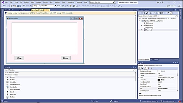
3.2 Creating a Picture Viewer UI
Let's build a practical Picture Viewer application to practise placing and configuring multiple controls on a form. This project demonstrates how controls work together to create a functional interface.
Control Specifications
| Control | Property | Value | Purpose |
|---|---|---|---|
| Form1 | Text | "Picture Viewer" |
Title bar caption |
| BackColor | AliceBlue |
Soft background colour | |
| StartPosition | CenterScreen |
Launch in screen centre | |
| PictureBox1 | Name | picViewer |
Reference name in code |
| BackColor | White |
White canvas for image | |
| SizeMode | StretchImage |
Fills the PictureBox area | |
| Anchor | Top, Bottom, Left, Right |
Resizes with the form | |
| Button1 | Name | btnView |
Reference name in code |
| Text | "View" |
Button label | |
| BackColor | LightBlue |
Visual distinction | |
| Button2 | Name | btnClose |
Reference name in code |
| Text | "Close" |
Button label | |
| BackColor | LightCoral |
Red signals exit/danger |
Setting the Anchor property of the PictureBox to Top, Bottom, Left, Right makes it resize automatically when the user resizes the form — so the image always fills the available space. Without anchoring, the PictureBox stays fixed while the form grows around it.
Picture Viewer Code
Add this code to make the View and Close buttons functional:
Public Class Form1

    Private Sub btnView_Click(sender As Object, e As EventArgs) Handles btnView.Click
        ' Open a file dialog to let the user choose an image
        Dim openFile As New OpenFileDialog()
        openFile.Filter = "Image Files|*.jpg;*.jpeg;*.png;*.bmp;*.gif"
        openFile.Title = "Select an Image"

        If openFile.ShowDialog() = DialogResult.OK Then
            picViewer.Image = Image.FromFile(openFile.FileName)
            Me.Text = "Picture Viewer — " & openFile.SafeFileName
        End If
    End Sub

    Private Sub btnClose_Click(sender As Object, e As EventArgs) Handles btnClose.Click
        Me.Close()
    End Sub

End Class
▶ Try It — Picture Viewer Simulation
Click View to load a sample image, switch SizeMode to see how each option affects display, then click Close to reset.
3.3 Building a Professional Login Form
A Login Form is one of the most common interfaces in real-world applications. This example shows how to combine Labels, TextBoxes, and Buttons into a clean, professional layout — and how to configure them properly in code.
Design the Form in the IDE
Add the following controls to a new form in the Visual Studio 2026 designer:
| Control | Name | Text / Key Property |
|---|---|---|
| Label | lblUsername | Text = "Username:" |
| Label | lblPassword | Text = "Password:" |
| TextBox | txtUsername | Single-line input |
| TextBox | txtPassword | PasswordChar = "*" |
| Button | btnLogin | Text = "Login", BackColor = LightGreen |
| Button | btnCancel | Text = "Cancel", BackColor = LightSalmon |
Public Class LoginForm

    Private Sub LoginForm_Load(sender As Object, e As EventArgs) Handles MyBase.Load

        ' Form setup
        Me.Text = "System Login"
        Me.StartPosition = FormStartPosition.CenterScreen
        Me.FormBorderStyle = FormBorderStyle.FixedDialog
        Me.MaximizeBox = False

        ' Label setup — bold font for clarity
        lblUsername.Text = "Username:"
        lblUsername.Font = New Font(lblUsername.Font, FontStyle.Bold)

        lblPassword.Text = "Password:"
        lblPassword.Font = New Font(lblPassword.Font, FontStyle.Bold)

        ' Hide password characters with asterisks
        txtPassword.PasswordChar = "*"

        ' Button colours
        btnLogin.BackColor = Color.LightGreen
        btnCancel.BackColor = Color.LightSalmon

    End Sub

    Private Sub btnLogin_Click(sender As Object, e As EventArgs) Handles btnLogin.Click
        ' Basic validation
        If txtUsername.Text = "" Or txtPassword.Text = "" Then
            MessageBox.Show("Please enter both username and password.", "Validation", _
                            MessageBoxButtons.OK, MessageBoxIcon.Warning)
            Return
        End If
        ' Authentication logic would go here
        MessageBox.Show("Welcome, " & txtUsername.Text & "!", "Login Successful")
    End Sub

    Private Sub btnCancel_Click(sender As Object, e As EventArgs) Handles btnCancel.Click
        Me.Close()
    End Sub

End Class

The example above is for learning UI design only. In a real application, never store or compare passwords as plain text. Use a proper authentication system with hashed passwords and secure storage. GitHub Copilot in Visual Studio 2026 can suggest secure authentication patterns — just ask it in the Chat panel.
▶ Try It — Login Form Simulation
Type a username and password below, then click Login. Try leaving fields blank to see the validation message. Click Cancel to clear.
3.4 Creating a Settings Panel
Professional applications often need a Settings or Preferences screen. This example demonstrates how to use GroupBox containers to organise CheckBoxes and RadioButtons into logical, readable sections.
Step-by-Step Setup
Add a GroupBox for Display Settings
Drag a GroupBox onto the form. Set its Text property to "Display Settings". Inside it, add three CheckBoxes with Text: "Show Toolbar", "Show Status Bar", and "Remember Window Size".
Add a GroupBox for Theme Selection
Add a second GroupBox with Text = "Theme". Inside it, place three RadioButtons: "Light" (set Checked = True), "Dark", and "Blue". RadioButtons inside the same GroupBox are automatically mutually exclusive.
Add Apply and Cancel Buttons
Below both GroupBoxes, add Button controls named btnApply (Text: "Apply") and btnCancel (Text: "Cancel"). Set their Anchor to Bottom, Right so they stay in the corner when the form resizes.
Public Class SettingsForm

    Private Sub btnApply_Click(sender As Object, e As EventArgs) Handles btnApply.Click

        ' Read checkbox states
        Dim showToolbar As Boolean = chkToolbar.Checked
        Dim showStatusBar As Boolean = chkStatusBar.Checked

        ' Read which theme radio button is selected
        Dim selectedTheme As String = "Light"
        If rdoDark.Checked Then
            selectedTheme = "Dark"
        ElseIf rdoBlue.Checked Then
            selectedTheme = "Blue"
        End If

        MessageBox.Show("Settings applied! Theme: " & selectedTheme, "Settings")
    End Sub

    Private Sub btnCancel_Click(sender As Object, e As EventArgs) Handles btnCancel.Click
        Me.Close()
    End Sub

End Class

Always group related controls using GroupBox or Panel containers. GroupBox adds a visible labelled border — ideal for settings dialogs. Panel is borderless and better for layout grouping you want to hide or show at runtime using Panel1.Visible = False.
▶ Try It — Settings Panel Simulation
Toggle the checkboxes and choose a theme, then click Apply to see what the code would output. Click Cancel to close.
3.5 UI Design Best Practices in VB 2026
Following established design principles ensures your applications look professional and are easy to use. Visual Studio 2026 ships with several built-in tools to help you apply these principles efficiently:
🎨 Consistency
Use the same font, colour palette, button size, and spacing throughout your entire application. Set these once at the form level using Me.Font and Me.BackColor so all controls inherit them automatically.
📐 Alignment
Use the Format menu → Align tools in Visual Studio 2026 to align selected controls to their left edges, centres, or right edges in one click. The snap-to-grid feature keeps spacing uniform while dragging.
⌨️ Tab Order
Set a logical tab order so keyboard users can move through controls in a natural top-to-bottom, left-to-right sequence. Go to View → Tab Order, then click each control in the order you want.
♿ Accessibility
Set the AccessibleName and AccessibleDescription properties on every control for screen reader support. Visual Studio 2026's Copilot can scan your form and suggest missing accessibility properties.
📏 Anchoring & Docking
Use Anchor to keep controls positioned relative to form edges when resized. Use Dock to fill an entire side or the whole form. This prevents layout breakage when users resize windows.
🎯 Minimal Clutter
Avoid placing too many controls on one form. If your form has more than 10–12 controls, consider splitting it into a wizard (multiple steps) or using a TabControl to group sections behind tabs.
The Copilot UI Reviewer feature (available in the GitHub Copilot Chat panel) can analyse your open Windows Forms designer and suggest accessibility improvements, alignment issues, and tab order fixes — just type "Review my form UI for accessibility and layout issues" in the Copilot Chat.
📘 Lesson Summary
- The Toolbox (Ctrl+Alt+X) is your palette of controls — dock and pin it for efficient development.
- Essential controls include Button, Label, TextBox, PictureBox, CheckBox, RadioButton, and GroupBox.
- The Anchor property makes controls resize proportionally when the form is resized — always set it for resizable forms.
- Use PasswordChar = "*" on a TextBox to mask password input.
- GroupBox containers organise related controls and make RadioButtons mutually exclusive within the group.
- The OpenFileDialog control lets users browse for files without you writing file-system code from scratch.
- Apply consistent fonts, colours, alignment, and tab order to every form for a professional result.
- GitHub Copilot in Visual Studio 2026 can generate control-setup code from comments and review your UI for accessibility issues.
Exercises
Practise the concepts from this lesson by completing the following exercises in Visual Basic 2026:
Exercise 3.1 — Personal Information Form
- Create a form that collects personal information
- Add Labels and TextBoxes for: First Name, Last Name, Email, Phone Number
- Add a GroupBox titled "Gender" containing RadioButtons: Male, Female, Other
- Add a DateTimePicker for birth date
- Add Submit and Clear buttons — Clear should reset all fields to empty
- Set a logical tab order: First Name → Last Name → Email → Phone → Gender → Date → Submit
Exercise 3.2 — Calculator Interface
- Design a calculator UI (no working logic required — just the interface)
- Add a TextBox at the top for the display (ReadOnly = True, TextAlign = Right)
- Add number buttons 0–9 in a 4×3 grid using Buttons
- Add operator buttons: +, −, ×, ÷
- Add special buttons: C (clear), CE (clear entry), = (equals)
- Use a TableLayoutPanel to keep the grid perfectly aligned
Exercise 3.3 — Enhanced Picture Viewer
- Start from the Picture Viewer built in Section 3.2
- Add a MenuStrip with: File → Open, File → Exit
- Add a StatusStrip at the bottom showing the image file name and dimensions
- Add a TrackBar for adjusting zoom (hint: change
picViewer.Size) - Add RadioButtons for SizeMode: Normal, StretchImage, Zoom, AutoSize
- Update the StatusStrip label whenever a new image is loaded
Related Resources
← Lesson 2
Designing the UI — Properties Window, form customisation and runtime properties.
Lesson 4 →
Writing the Code — event handlers, variables, and making controls interactive.
WinForms Controls
Official Microsoft reference for every Windows Forms control available in .NET 10.
VB Sample Code
62 practical VB.NET examples including fully-designed Windows Forms projects.
Featured Books

Visual Basic 2022 Made Easy
The complete beginner guide to Windows Forms development — covers Toolbox controls, UI design, event handling, and more in a clear step-by-step format.
View on Amazon →
Visual Basic 2026 Made Easy
48 fully-explained real-world VB.NET programs — ideal for practising the UI and coding skills introduced in this lesson.
View on Amazon →